![[Starship Modeler's 9th on-line modeling contest: The Other Guys]](other_guys.jpg) |
Contest Rules |
Freighter |
|
|
|
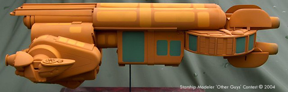
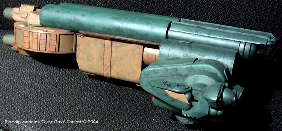
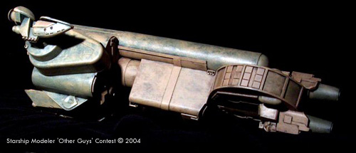
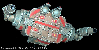
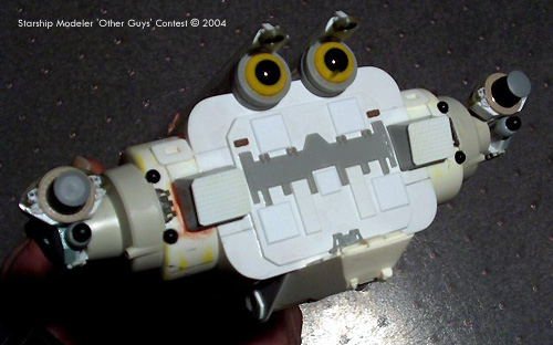
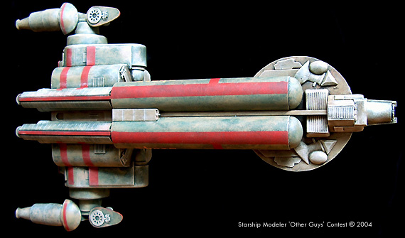
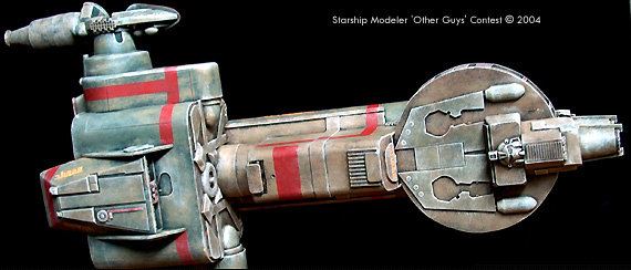
For the competition I wanted a bulky, blocky freighter. As with any terrestrial freighter, the cargo hold is the far larger part, so I put that in front. The face on the surface of the largest part was serendipitous, but then things started to go a little pear-shaped. After it was all assembled, with the big end forward and the little end aft, and a bright yellow paint job applied, even the friends who readily lied that the yucky color was beautiful steadfastly insisted the ship was backwards. Even after I repainted it. It's a problem I often have with friends - Er, spaceships. I know the importance of building ships so that an observer would feel confident with his answers to a few simple questions, such as, does it look like it could be a spaceship, how big is it, and which way does it go, and that failing to make obvious the answers to any of these questions destroys the illusion of reality. Still, a lot of ships are just plain wrong, and this was one of them.
The main cargo module started as a wristwatch container, flanked with giant triangular "candy corn" containers and AT-AT feet, and chinned with a Ravenstar CM-16 component. I cut out the interior of the wristwatch box and made it the middle module. The round part was a section of a plastic drinking glass. The original engines (before they became docking ports), laying above and below the disk, were made from Ravenstar FE-04's. The dorsal fuel tubes tied it all together and added the first hint of a face at the front (later, back), a look I encouraged with eyebrow "shields" and teeth-like cargoe hatches. The less said about the original paint scheme the better. The final painting started with a layer of flat black over the sandable primer. I dabbed dark-green over parts, and millitary brown over others. This was the basis of the two-tone effect that was blended together with a dabbed layer of tan. The stripes are red, again dabbed-on after being masked-off. The lettering is custom-made dry transfers, as I figured the texture of the dabbed paint would make decals difficult to keep from silvering.It was at this point I changed the orientation of the ship by making the initial engines docking tubes and adding cylindrical engines to the face-flanking features. Finally, radome tan was dry-brushed over the details and corners, making the details more apparent and giving the paint a worn-off look. Image: Rear view, in the original fetching paint scheme Image: Starboard side Image: Left/rear, in the new livery Image: Bottom/right view Image: Stern Image: Stern, before paint Image: Top view (bow faces right) Image: Bottom view |
||
![[Port side]](images/scr_11_freighter_side_1_big.jpg)
![[Front]](images/scr_11_freighter_nose_big.jpg)
This page was last updated 14 October 2003